Outdated Fonts Out, These Free Body Fonts Are In 2026
- Deena Englard
- Feb 11
- 2 min read
Updated: Mar 3
I’ve done a bunch of other articles about fonts that you can find here, but I recently realized that they’re getting kind of outdated.
Time for a refresh of the fonts I’m currently using - specifically, the body fonts.
Choosing a good body font can be just as complex as selecting the right headline font. It needs to match the style you’re going for - high end, corporate, friendly, playful, approachable, etc.
Small details can make a big difference, like the:
X-height (for legibility)
Width (extra wide = extra elegant)
Shape of the lowercase “a” and "g" (is it a playful circle or a more serious two-story?)
Pointiness of the uppercase “M”/”N”/”W” (too pointy = not so friendly)
And you also want a font that has a lot of weight variations.
For a headline it’s ok to have just one or two weights, but for a body font you want a lot of options to cover every possible scenario.
So if you’re looking for some new options or even just inspo, gathered below are my current (as of February 2026:) go-to modern body fonts, sorted by use type, all sourced from free sites - Adobe Fonts or Google Fonts.
My Go-To (Free) Modern Body Fonts
Great for High-End Brands

Red Hat

Sweet Sans Pro

Brother 1816
Great for Approachable and Non-Profit Brands

Neulis Sans
Also comes in Neulis Cursive and Neulis Neue alternatives that have too much flair for a body font but match well for headline fonts and logos.

Natom Pro

Gibson

Real Text Pro

Circe
Comes in both Regular and Rounded
Great for Corporate Brands
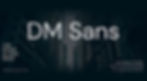
DM Sans

Neue Haas Grotesk
A Helvetica alternative

Graphie

Sofia Pro
This article took you 2 minutes to read, but it took me 1.5 hours to put together. If you enjoyed, please consider sharing it with others.